A creative life in Kyoto, shaped by different worlds.
I'm Ambre, a graphic designer originally from the French side of the Swiss Alps, who found a second home in Japan.
What began as a year abroad in 2016 brought me back to Japan in 2018 to work as a graphic designer, and eventually became the life I chose to build here.
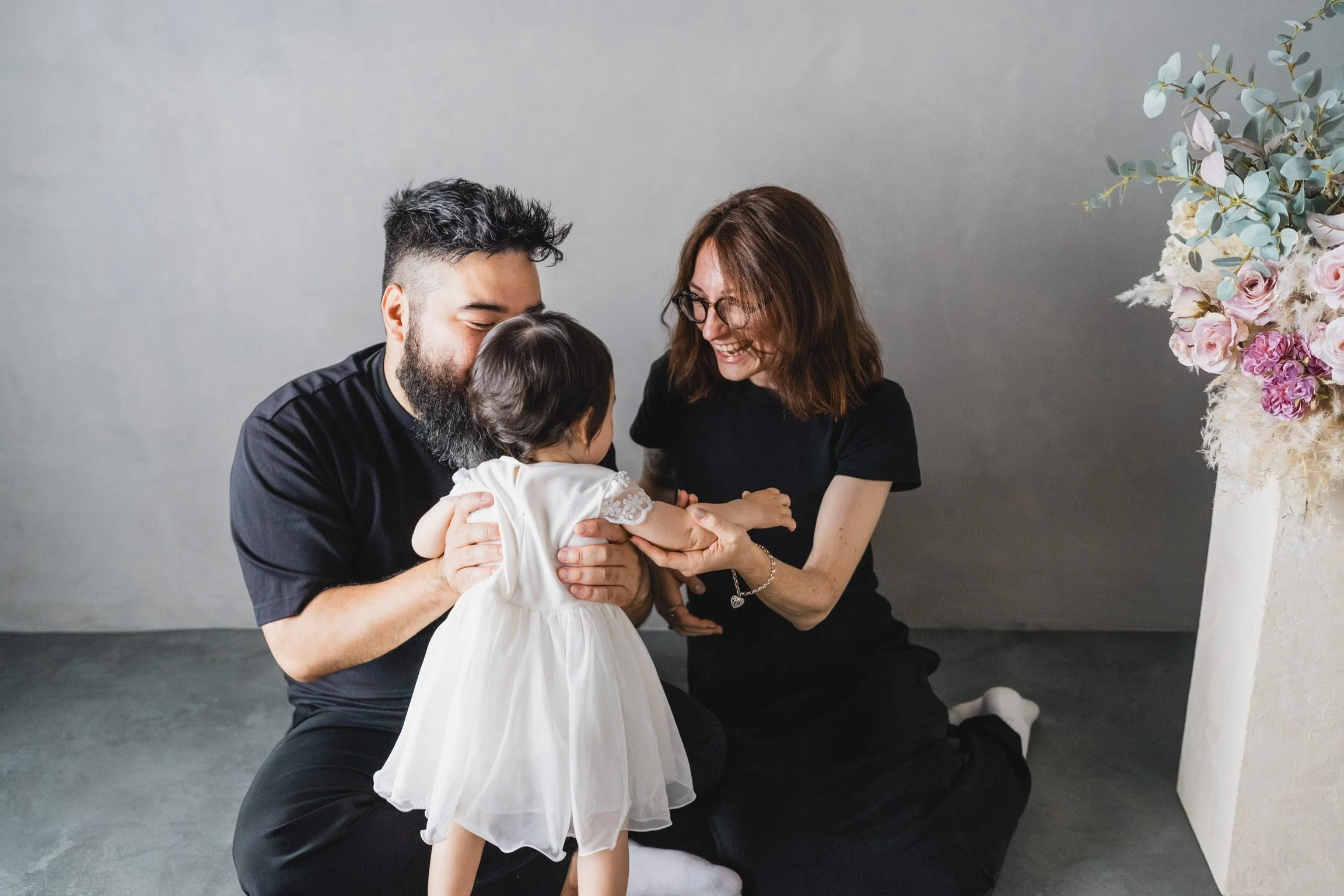
Today, at 34, Kyoto is my home. It's where I've built my family, where my daughter was born, and where my personal and creative stories have grown together.
I'm inspired by Japanese aesthetics, from the structure of its writing systems, to its attention to detail and the wabi-sabi appreciation of imperfection and natural textures.
Through Ambre Kohaku, I bring these different parts of my world together, one word, one composition and one print at a time.
—
Art, language,
and everything in between.
—
“My work comes from my own perspective as a foreign creative who happens to call Japan home.
I take inspiration from the environment around me, while being conscious of my position within it. I believe influences can coexist without needing to compete or become one another.”
From France to Japan
I'm Ambre, a French illustrator and graphic designer based in Kyoto, Japan.
My relationship with Japan began in 2016, when I first came here as a student for a year. I returned in 2018 to work as a graphic designer, and I never really left.
Since then, Kyoto has become much more than the place I live. It's where I’ve got married, where I built my family, where my daughter was born, and where so many chapters of my personal history have unfolded.
Living alongside influences
I'm not trying to redefine Japanese tradition or claim to represent an identity that isn't mine. My work comes from my own perspective as a foreign creative who happens to call Japan home. I take inspiration from the environment around me, while remaining conscious of my position within it.
I believe influences can coexist without needing to compete or become one another. Traditional craftsmanship, contemporary graphic design, digital art, architecture, video games, popular culture and everyday life can all exist within the same creative world. They certainly do in mine.
Fashion background
My visual language has its roots in graphic design and fashion.
I first learned to work with Adobe Illustrator during design school, where I specialised in fashion design, pattern-making and the creation of both figurative & abstract textile patterns. This curriculum taught me to think in terms of shapes, structures, repetition and composition.
Today, I have that same approach to Japanese typography.
Architectural influence
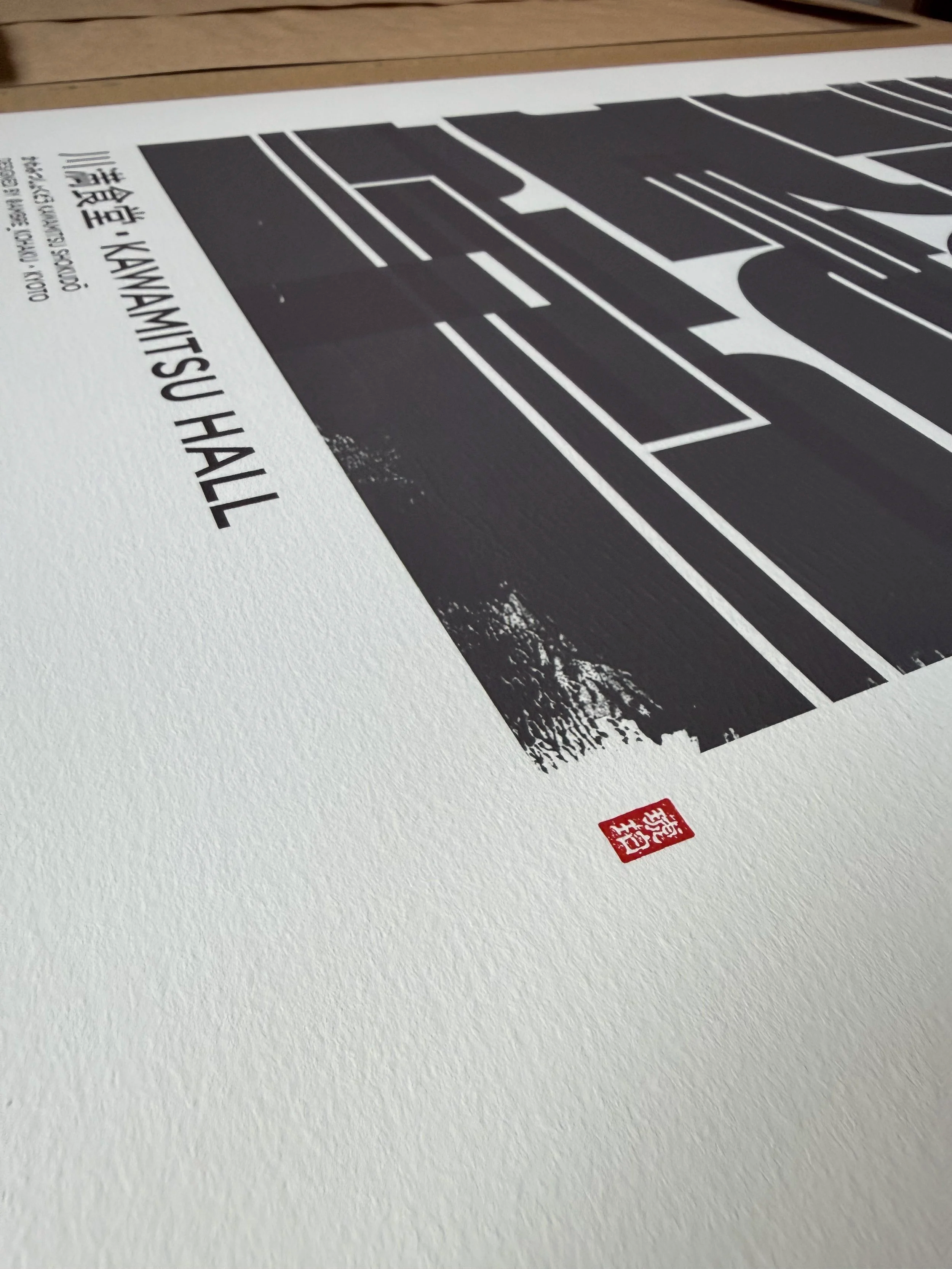
I deconstruct kanji and rebuild them with geometric forms by respecting traditional stroke order. So I’m somewhere between graphic design and typography, with a strong Brutalism influence.
By this I mean my work borrows its structural vocabulary: strong geometry, bold forms, visual weight and interlocked composition. And then the textures soften that vocabulary.
Geometry meets Wabi-Sabi
I like the structure and boldness often associated with Brutalist design, but I don't want my work to feel cold, flat, or too sharp.
That's where texture comes in.
I use painted gestures to bring “the human made” a sense of imperfection to the compositions. Stains of ink, irregular marks of a wet paint roller, or the traces of a dry brush completely change the atmosphere of a piece. Much like the beauty found in the irregularities of ceramics (in the spirit of kintsugi) I see these marks as details that give an artwork its character.
Come say hello!
Do you connect with my work? Do you live in Japan, or do you have your own connection to the country? Whether you have a question about a print, an idea for a custom piece, or simply want to say hello, feel free to reach out.
I'm developing my activity as an independent artist, alongside the everyday life of being a mum, so Instagram is usually the easiest way to get in touch. It's also where I share new work, experiments and little glimpses behind the scenes.